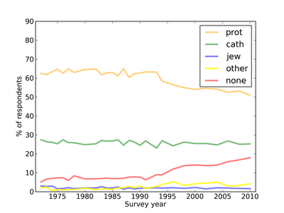
Secularization in America: part four
Summary so far
In Part One I described trends in market share of major religions in the U.S.: since 1988, the fraction of Protestants dropped from 60% to 51%, and the fraction of people with no religious affiliation increased from 8% to 18%.In Part Two I used data from the 1988 General Social Survey (GSS) to model transmission of religion from parent to child, and found that the model failed to predict the decrease in Protestants and the increase in Nones that occurred between 1988 and 2010.
In Part Three I looked at changes, between 1988 and 2008, in the spouse tables (which describe the tendencies of people to marry within their religions), the environment table (which describes parents' decisions about their children's religious upbringing), and the transmission table (which describes the likely outcomes for children raised within each religion). I found that the transmission table has changed substantially since 1988, and accounts for a large part of the observed increase in Nones, but not the decrease in Protestants.
Religiosity curves
Respondents in the GSS are surveyed at different ages, so we can get a sense of when people lose their religion (or acquire one). I collected all GSS respondents and partitioned them by the religion they were raised in and the decade they were born. For each of these subgroups, I plotted religiosity (the fraction with some religious preference) as a function of age when surveyed.Here are the curves for people raised Protestant:
In the top right, we see that people born between 1900 and 1910 and raised Protestant were likely to be religious when they were interviewed in their 70s and 80s. In the lower left, we see that people born in the 1980s were less likely to be religious when they were interviewed in their 20s.
For the middle generations, we have a better sense of changes in religiosity over a respondent's lifetime. Several of the curves have an apparent peak in middle age; if this apparent effect is real, the location of the peak may be shifting left.
Overall, these curves are relatively flat, which suggests that respondents are not changing substantially after adulthood (everyone in the GSS is 18 or older).
The curves for Catholics are similar:
Again, there is a substantial differences between generations, but within each generation, little change over the respondents' lifetimes. People born in the 50s, 60s and 70s might be leaving the church as they age, but it is hard to tell in this plot whether these trends are statistically significant.
Finally, here are the curves for people raised with no religion:
There are only enough respondents in this category to plot curves for a few generations, and even then, the curves are noisy. Not surprisingly, people raised without religion are less likely to be religious, and recent generation are less religious than their elders. Again, the curves are generally flat, suggesting that people generally do not change religious affiliation as adults.
A possible exception is that people born in the 1970s and raised without religion might be finding religion in their 30s. But this data point is based on a small number of respondents, so it is probably too early to tell.
Why people switch
In 1988 the GSS asked respondents questions about changes in religious affiliation and the reasons for the change. Unfortunately, it looks like this data won't do me much good, because:- In many cases where a respondent switched from a religious preference to None, they were not asked why.
- There are so many inconsistencies in the data, I wonder if it might have been mangled.
- Because these questions were only asked once, we can't track trends.
So that's disappointing.
Modeling a mixed-age cohort
One of the challenges of working with GSS data is that the respondents each year are a mixture of people of all ages. From year to year, the oldest generation drops out of the cohort and the youngest generation joins the mix.So when there is a trend from each generation to the next, as with religious behavior, there is a lag before the trend appears in a GSS time series, and the slope of the trend is much slower.
However, for purposes of prediction, this lag is actually useful. For example, 18 years after a baby boom, there is likely to be a spike in college enrollment; that's not really a prediction about the future; it's just a consequence of something that has already happened.
Similarly, we already know what most of the GSS cohort will look like next year. It will look like the cohort this year, one year older. The difference is that a few of the oldest respondents are replaced by the next group of 18 year olds.
In the 2010 cohort, the age range is roughly 20-80. To predict the 2020 cohort, we can:
- Remove respondents older than 80.
- Age the rest of the respondents by 10 years.
- Add a new batch of respondents in their 20s.
Step 2 might be hard if people were changing religious affiliation as they age, but as we saw above, they generally do not. Step 3 is harder, but there are two reasonable options:
- Conservatively, we can assume that the next generation will be like their immediate predecessors.
- Alternatively, we can extrapolate from current trends. This option is probably better for prediction, but in some ways unsatisfying because it does not explain the cause of the trends, or why we should expect them to continue.
If we use this method to predict 20 years into the future, we replace about 25% of the cohort with simulated respondents. But since 75% of the prediction is based on simple population aging, it is likely to reliable.


Komentar
Posting Komentar